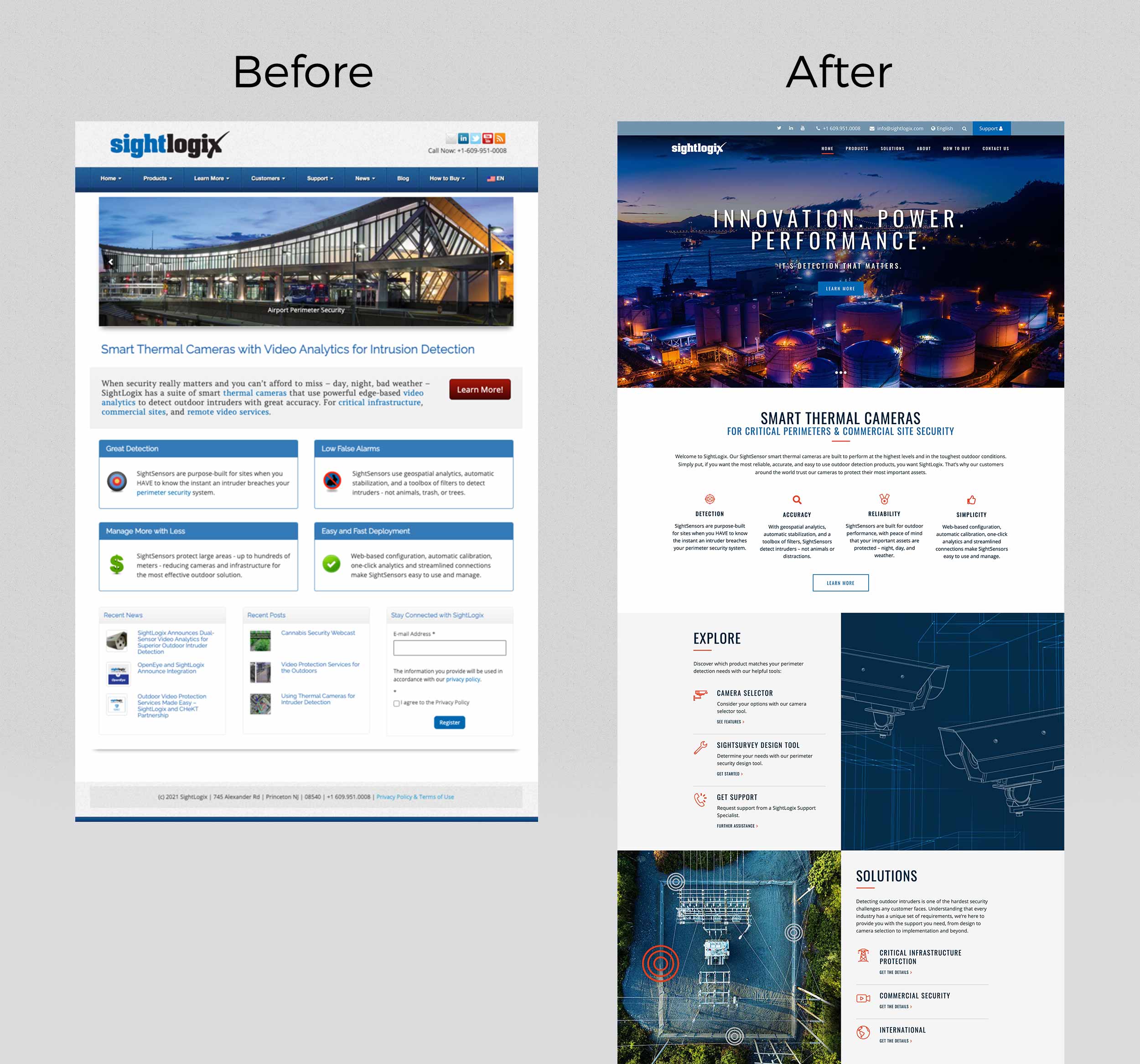
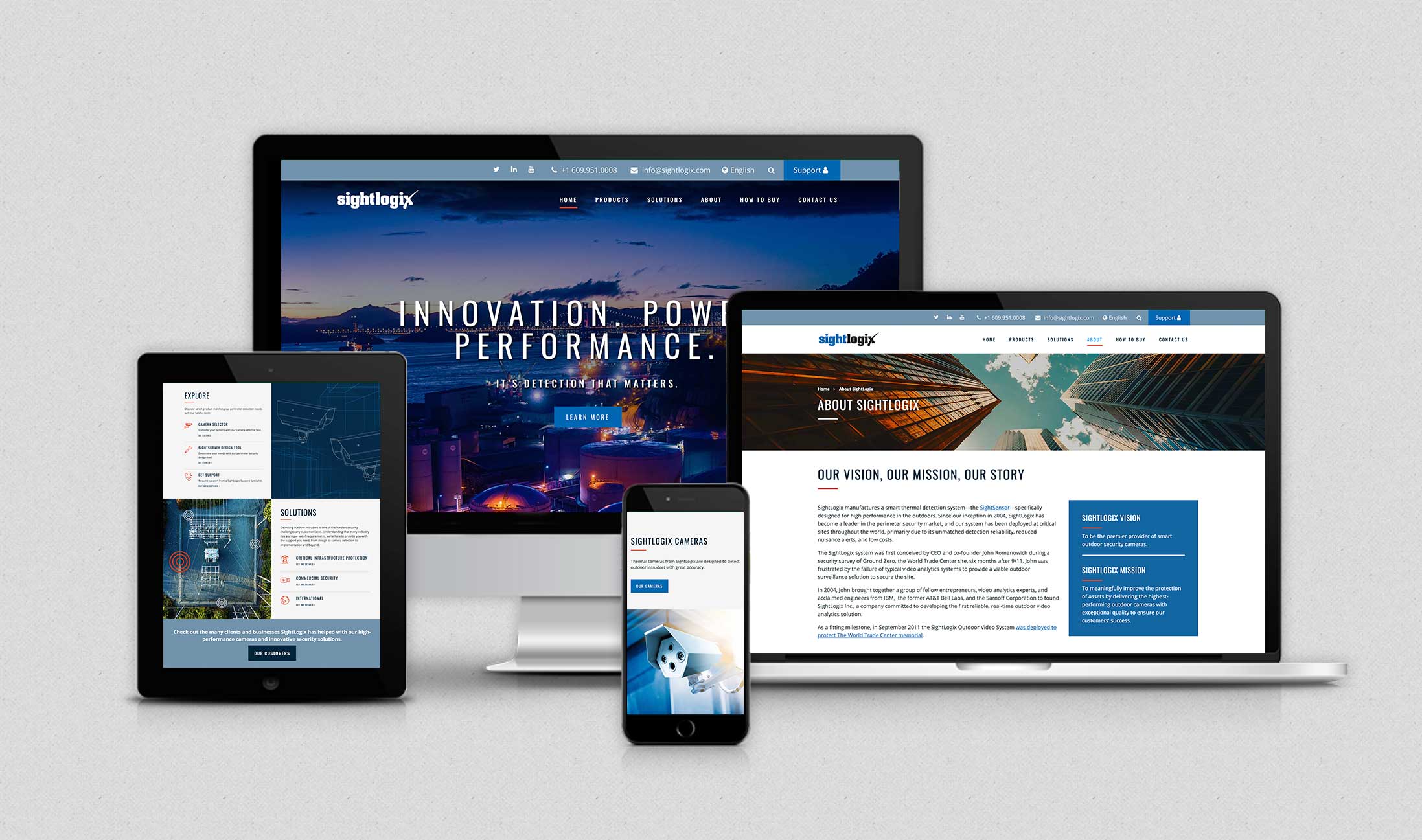
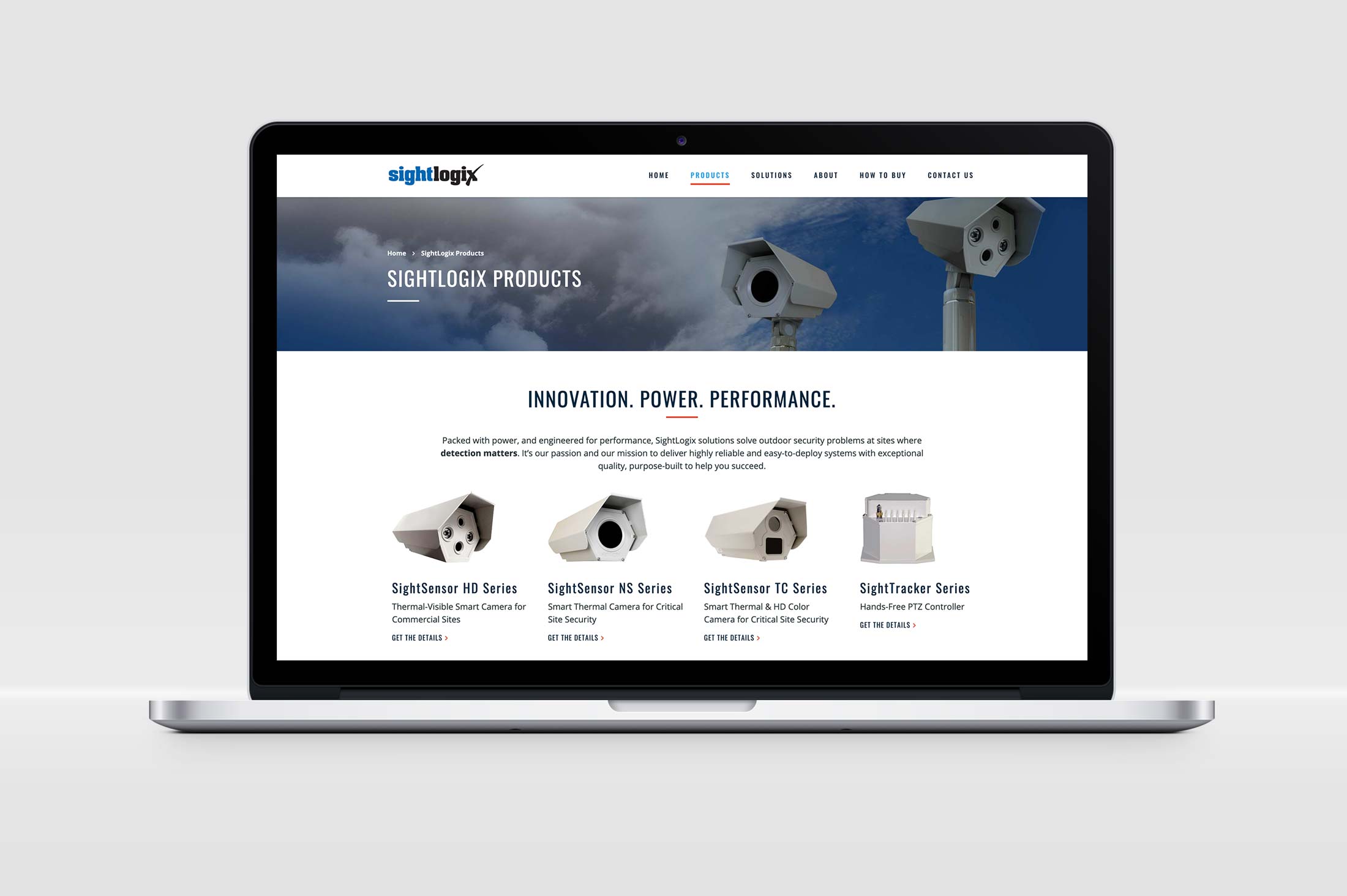
We are delighted to announce the launch of another HDG custom-designed website, www.sightlogix.com. And, wow, what a site! Drawing upon the talent of HDG’s branding, communications, and web design team members, we worked collaboratively with the client team at SightLogix on this project from concept to launch. It’s the teamwork that always makes the difference—thank you, SightLogix!
SightLogix designs and manufacturers smart thermal security cameras. Their products are sold through certified system integrators. Pioneers in their industry, these powerful, innovative devices can detect outdoor intruders with great accuracy even under the most difficult conditions—day or night, inclement weather, and large spaces. The marketing team was looking to update their website with these goals:
- improve the overall visual appeal of the website
- better communicate “who we are” and their position as a thought-leader within their industry
- improve the navigation to make it easier for site visitors to find quickly what they’re looking for
- improve SEO performance and conversion rates

So, it’s never “just a redesign”.
At HDG, our roots are grounded in design excellence, branding, and communications—every image, every message, every touchpoint, and every page on a website matters to us. With an emphasis on UX design principles, we approach our website projects with these three priorities:
- How do we help our client best communicate visually and in words the answer to these questions—
- who are you?
- what do you do?
- why should I care/what can I do on your site?
- What can we do to help our client meet their business and marketing goals?
- How do we create a site that captures a site visitor’s attention from the moment they land on it, keeps them engaged, and is easy to use?
The Road Map
With the above framework in mind, for the SightLogix project, our discovery process included a detailed questionnaire for the marketing team, an analysis of their google analytics, the creation of an empathy map for both system integrators and end-users, and a content audit.
From the beginning it was clear, SightLogix needed a better way to communicate their expertise and demonstrate their breadth of capabilities to a broad audience of industries that ranged from critical infrastructure to commercial businesses. Their existing website also included a wealth of information—from detailed product guides and data sheets to whitepapers, videos, case studies—that needed to be organized in a way that would help a prospect as they travelled through the sales process and then for a customer in need of support.
We started with simplifying the top navigation. Documenting our thoughts in meticulous detail, we established a new hierarchy of information and a flow of content based upon organizational goals and user needs. For each key page on the site, we outlined key messages, micro-messages, content descriptions, relationships to other pages (internal and external), and content type. For product and solution pages, we established a content model. To bring everything together, we recommended a mega menu display, allowing site visitors to quickly drill down to the category most relevant to their industry, where they can find detailed information on the company’s offerings.
With a new foundation for the site in place and client approval to proceed, we worked with our search partner, Fortune Web, to build a plan to optimize the site for search engines and to ensure a seamless transition from the old site to the new one. This also laid the groundwork for any search marketing campaign once the site was launched.
About the Design
For design considerations, our goal was to create a more contemporary looking site that better reflected this dynamic, progressive, and growing firm. We selected a WordPress theme that allowed our client to showcase their solutions, custom designing the product pages and various sections throughout the site. As part of the design process, we presented wireframes to visualize content specs and the flow of information; and then design concepts to capture the overall look and feel of the site. With an emphasis on mobile as well as desktop, visual elements to improve the user experience included:
- Full page headers with beautiful eye-catching photography—carefully selected images to communicate broad outdoor spaces and the complexity of location coverage in the client’s security solutions
- Lots of white space to focus the user’s attention on the most important messages and for ease of reading
- Prominent calls-to-action, bold fonts, and use of icons and bullet points as clear cues for visual hierarchy
- Playful cursors to keep you engaged on the page
- Use of video for rich user experience


Our Secret Sauce
In marketing, people like to talk about the “secret sauce”—what makes you unique. Clients come to HDG because of our design excellence, branding and communication skills, and expertise—from managing their technical requirements to the organization of content and understanding of the user experience. But it’s our ability to think and then work with our clients like we are a member of their team that is what really makes us different. The SightLogix website was a project that we worked with our client side-by-side. It was an honor to be chosen to do this work and we’re delighted with the finished product!
“I wanted to take a moment to acknowledge the outstanding performance and my deep appreciation of the HDG team. For every aspect of this project, I could not be happier with the results—in fact, I am thrilled.”
–Eric Heller, Director of Marketing, SightLogix